
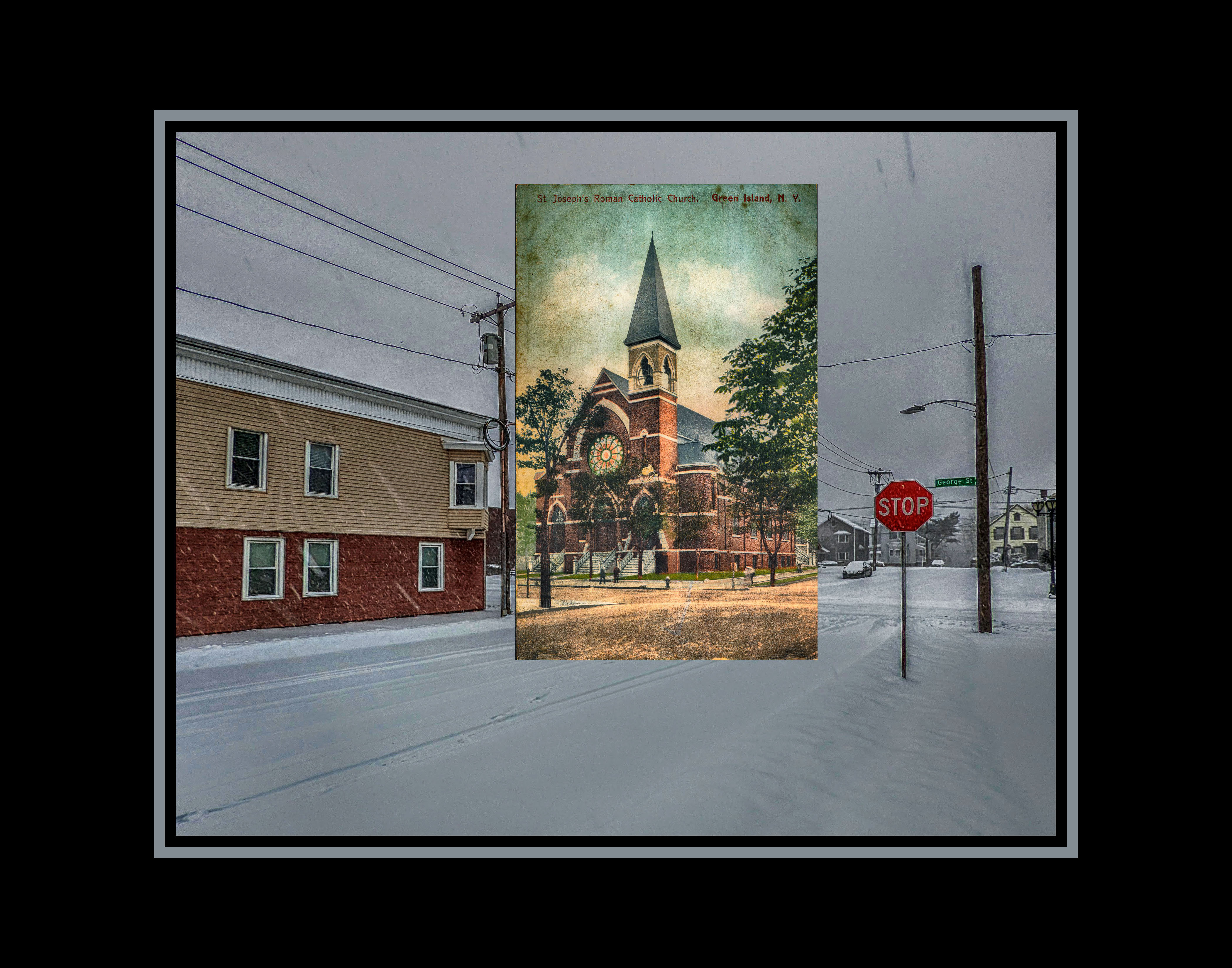
I recently created an art image by superimposing a vintage postcard of St. Joseph’s Church in Green Island into a current photo at that same location. I liked it. Liked it a lot. I thought it was good enough to enter into competition.
As I said … it’s good enough.
But the more I look at this photo, the more things I dislike about it.
There’s nasty “ghosting” along the telephone poles and the STOP sign. And there’s not enough leading line definition between the two images. It almost looks I put the photo in over something else and it’s close enough. That’s not an award winner. That’s not a silk-generator. I can do better than this.
And it turns out, another Green Island-based postcard showed up on eBay the other day. And I snapped it up.
Background.
There’s a building on the corner of James and Arch Street in Green Island, and it has a history. I’m quoting now from a book on the bicentennial history of Green Island.
“In the spring of 1878 the village fire department was organized, comprising the William E. Gilbert Hose Company (organized in 1873) and the John McGowan Hose Company … The McGowan Hose [was named after] John McGowan, the stone mason … The McGowan Firehouse was built in 1876 at the corner of James and Arch Streets. The horse barn was in the back. Upstairs was a room for the driver and storage rooms … It is interesting to note that the same horses were used on both the fire wagon and the garbage wagon. In case of a fire the team of horses was unhitched from the garbage wagon and raced back to the fire house to take out the fire wagon.”
That’s right, folks, you read this blog for any period of time, you’ll get an education.
So I snagged the postcard. And this one is a doozy. Look at this.

Wow. That’s an impressive picture.
The postcard was originally sent to an Arthur Mitchell of Ballston Spa, and apparently Ballston Spa was small enough that no street address was necessary for a successful delivery to Mr. Mitchell. The postmark denotes that the card was mailed from Troy in 1915, hence the card’s 1c stamp and cancellation information. This information is extremely important. The 1915 postmark means that the card was manufactured in 1915 at the latest, but likely much earlier than that. And since the card was manufactured prior to 1923 … the postcard’s artwork is considered in the public domain. Aces.
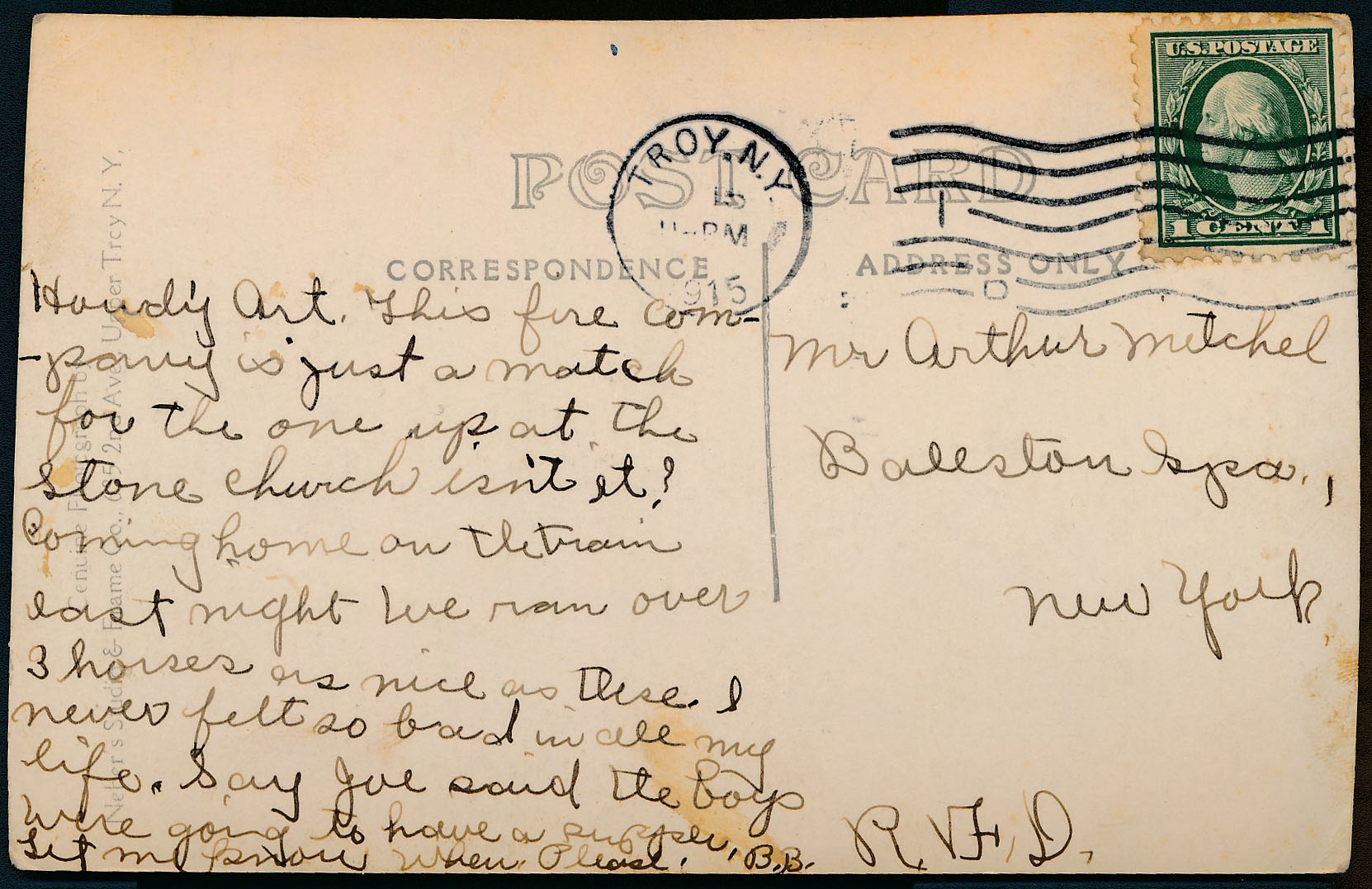
More information on this little treasure. The postcard itself was manufactured by Neber’s Studio & Frame Co., located at 685 Second Avenue in “Upper Troy,” or what we call Lansingburgh today. The postcard’s message is a wee cryptic, and the handwriting is a bit flowery and hard to decipher, but I think I transcribed this pretty well.
“Howdy Art. This fire company is just a match for the one up at the Stone Church isn’t it? Coming home on the train last night we ran over 3 horses as nice as these. I never felt so bad in all my life. Say Joe said the boys were going to have a surprise. Let me know when please. B.B. R.V.F.D.”
So anyways…
The image on this card is too faded for my taste. So I punched it into PhotoShop to draw out as much of the details as possible. I came up with two images, one B&W, one in sepia.


The goal now is to visit the building (which still stands today) and look for matching points and angles. The building’s original front entrance has been boarded up to create an interior wall, but the windows and railings remain similar to that of the postcard. And the fire hydrant seems to be in the same spot as it was 100+ years ago.
I took a few angled shots with my cell phone, including a “reference point” shot of the street below my feet to align my approximate location with the pavement cracks. A few photos with my cell phone camera will be fine for now, but I need to come back with my Nikon Df and an ultrawide camera lens … and I have to come back when there’s proper sunlight to my back, without any shadows from the houses on the other side of James Street.
On Wednesday afternoon, I did just that. Stood on the corner of James and Arch Streets, Nikon Df at the ready, with my ultrawide Vivitar 19mm f/3.8 lens on the chassis. It appeared that the original photographer stood directly in the intersection of James and Arch Streets, so I did the same. Essentially, I did the Time Warp in the middle of the thoroughfare. Two shots, jump to the left. Two shots, a step to the right. Two more steps – someone’s honking their horn. Oh, yeah. Gotta give the right of way to the CDTA bus that’s passing by.
Okay. Took a barrage of photos. Now it’s time to line everything up. I used whatever reference points were equal in the 1915 and 2022 images – the corner of the building, the fire hydrant, the windows on the structure. Most everything else had changed; heck, the road itself had been re-graded, so the curb wasn’t in the same spot from 100+ years ago.
After a few twists, turns, wiggles, tossies, re-tries, tossies, and re-tries, I found one photo that nearly matched the image. And after careful alignment …
Here’s what came out.

I used the sepia-toned postcard enhancement, just because in the end, I felt that the B&W version looked like I had just hired a rider, two horses and a vintage pumper to just park there, while the sepia image seemed more authentic.
But yeah. Short pile for Competition Season FOR SURE. Maybe even BUILT.
I’m good with this. Really, I am.
Unless I find another postcard from long, long ago that would make an even better superimposed image.
But that’s for another time. 😀

You may find it easier to check alignment using a desaturated new photo as the colour can distract from the shapes.
LikeLike